In the last quarter, we have started a plan to completely redesign the user interface (UI) of the Cloud Academy website, and we used this opportunity to introduce a fast, reliable, and highly reusable interface that covers the majority of cases. We chose React as the main library for building our front-end applications because its principles provide the best approach for building small and easy components that lead to building more complex interfaces.
At Cloud Academy, we have some frontend apps with a lot of components created using principles of Atomic Design. At first, we thought it was the best choice for us, but in these three years we noticed some drawbacks:
- Initial atoms or molecules didn’t reflect the concept of atom and molecule. Adding props and styles every time we touched a common component interface broke that rule and we didn’t have common rules or guidelines when editing them — if I needed a new boolean prop I would simply add it and set the inverse value as default where that atom is used.
- Different pages or site sections had similar designs, but we incorrectly used two components or more. For example, we had different tab components!
- We didn’t have common design guidelines, and buttons shapes were different among different pages (different font sizes for label and icons, different colors, and behaviors).
- Without having an updated list of what we had, it was difficult to easily reuse them. We didn’t have a visual list of what we had, so the Design Team and our internal stakeholders used to propose different versions of the same components every time (and often we discovered it only after designs were approved).
We initially considered and evaluated various UI toolkits, but they were too vague or complex for us, so we decided to start from scratch and create one which fits perfectly our needs and guidelines. We wanted to have a common style and common behaviors across our products without either doing CSS magic or adding additional props on components. Plus, we wanted to start a smaller project using TypeScript before migrating bigger repositories (we use vanilla Javascript in our main React projects at the moment).
So the birth of Bonsai, our UI library, was introduced.
The basics
Before we dive into our UI journey, let’s start with the basics. If you’re already an expert on these topics, feel free to jump right into the story. A UI library (also called a component library) is a repository that contains all reusable components and interactions to ensure consistency across a brand and product. Typically, a group of UX designers, software engineers, and product managers work together to create it and its purpose is to compose layouts in no time: it should be easy to use and offers a lot of prebuilt components in order to spend less time on the visual phase of the development.
To get familiar with React, check out Cloud Academy’s ReactJS: Zero to Hero Learning Path. This guided learning experience provides a complete guide to building scalable web applications using Facebook’s popular ReactJS library. If you have intermediate JavaScript and ES6 skills, you can jump into a guided hands-on lab: Developing Applications Using ReactJS. In this real lab, you’ll log in directly to the Microsoft Azure Portal and will be guided throughout the process of developing applications using ReactJS to create reusable, interactive UI components.
Our first steps into a new world
Last year, we set the goal to entirely refactor one of our biggest product codebases: Training Plans. Working together with our Design Team from the beginning helped us to define our first basic components which need to be reusable everywhere on the platform.
Our biggest challenge was getting a consensus between our frontend engineers. We had a lot of meetings where we discussed strict guidelines that everyone had to follow and we argued sometimes on some concepts, but now we have a shared common vision on how we want to work with this UI library.
UI library base rule
Our base rule is:
When using a common component you don’t need to stylize it or add additional props by extending it; otherwise, you are going to repeat the same mistakes we made at the beginning.
These mistakes include duplication of code, duplication of similar components that differ slightly one from another, and uncertainty on which component you need for your feature.
We use styled-components library from the first line of code we wrote more than three years ago, so we are going to continue using it. In order to follow our golden rule, we don’t want to expose the className prop outside when importing one of the components we created, so we are 100% sure our button with primary palette will be always blue (obviously you can still overwrite our rules using CSS descendants). For particular cases, we extend the base element props with the famous className one and export a styleable version of that component (see the reference for link one).

The TypeScript factor
As I said before, we started the Bonsai UI library project from scratch using create-react-app and TypeScript.
Why TypeScript?
TypeScript pros and cons can be found with a Google search, and probably too long to discuss in this post. In short, in our case, TypeScript:
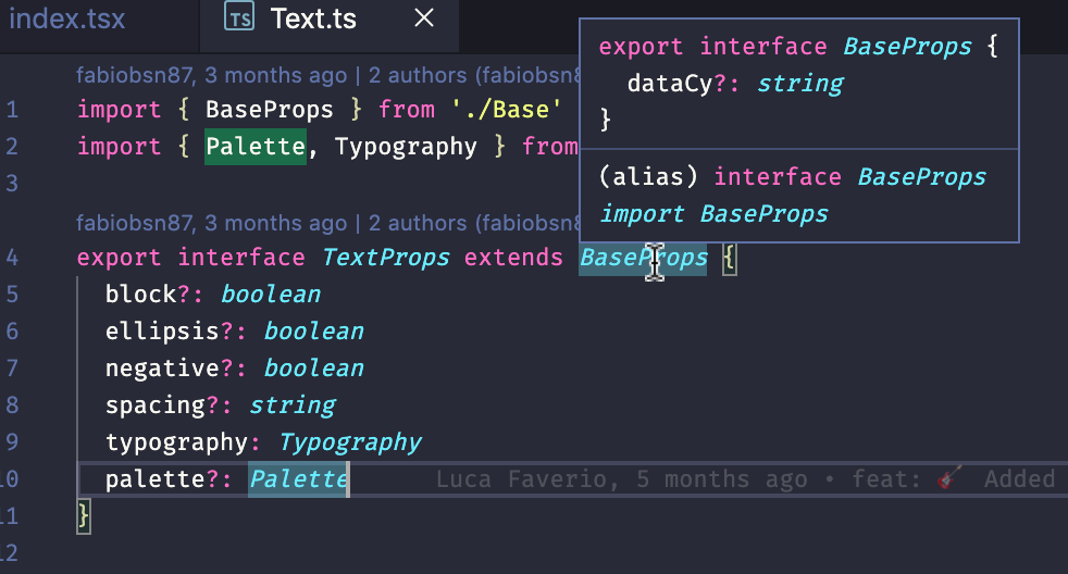
- Helped a lot using interfaces for defining prop types. Shared interfaces can be used among different components and can be extendable with additional fields or interfaces, and the code is cleaner and easier to understand. For example:
printUser (name: String, dob: Date): Stringis pretty explanatory than reading the whole function code and understand what it accepts and what it could be returned.
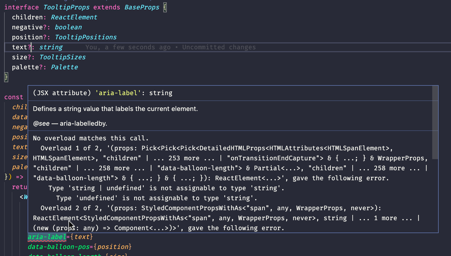
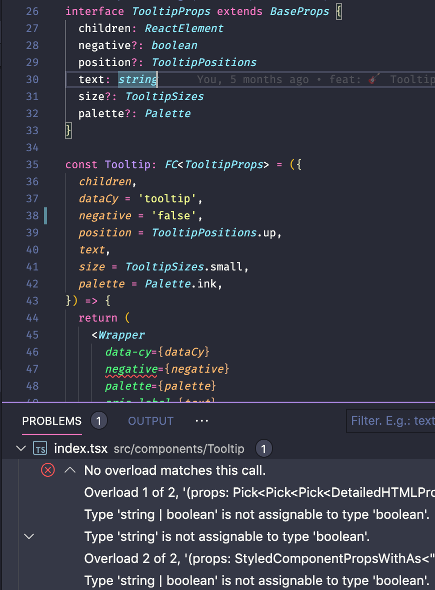
Extending interfaces starting from a base one - Using types and not observing them lead the TypeScript compiler to throw errors. While we still use
prop-typeslibrary in React, for me it’s not enough to prevent errors while passing data from one component to another so the typedef compilation check saved us a lot of time in future fixing bugs.In this case, we set text optional but we didn’t cover the case In this one instead of a Boolean value we passed false as String - Some of us have more of a back-end background, and so they are used to typed languages. TypeScript is a superset for Javascript, so if you already know Javascript, learning TypeScript is not a big deal.
- Having knowledge on what is the current trend in the Javascript ecosystem, as reported in Javascript Flavors.
After our initial attempt, it now won’t be so difficult starting a new project using TypeScript directly instead of old good Javascript. A lot of frameworks offer TypeScript support out-of-the-box (for example Next.js and create-react-app, our starting point for our UI library).
Getting started
In order to isolate basic components on the new UI, we started to write some code. Storybook allows us to write code and preview it immediately with no need to hard-refresh pages. After we define props and their types by discussing the interface of a new component, writing basic elements is a piece of cake.
With additional Storybook packages, addon-knobs and addon-docs, we can test various cases while developing.
addon-knobs helps us to directly test components by changing its props values on the fly. For example, loading our palette colors directly from the Enum definition and viewing live versions or toggling a boolean value by simply checking on a checkbox provided.

addon-docs builds documentation files for component’s props ,and you can integrate different previews based on prop combinations using markdown syntax inside JSX.

Our current UI library
We now have around 30 components that are used in various pages on our website and in some other non-public projects. By using them, we write less code, and, most important of all, we maintain a common UI. With exported Enums, we have to follow the previously defined rules. Our projects’ styled files start to become only div wrappers for our components and reusing them will be more and more usual. Little by little when refactoring old code, we tend to rewrite that part with Bonsai.
What’s next?
Our goal is to make our source repository public on Github. At the moment, our code is on Bitbucket company account and we published a new version on npm by merging pull requests to master branch using a semantic-release package for versioning and a Jenkins pipeline which doing the dirty job.
On npm the repository is public so if you want to try in your React project you are free to do yarn add @cloudacademy/bonsai following the documentation on our public storybook.
We are continuing to add components and refactor old ones where it is necessary to cover future requirements. We have in plan to create a simple and reusable layout grid (we still rely on writing basic flex components every time in our projects), basic placeholder elements (single shapes like rounds, rectangles, and similar ones when fetching external data), and extending current ones for accepting also external resource, but we have a long list of improvements scheduled!
A big thanks to Giacomo Sortino, Luca Faverio, Fabio Besana, Matteo Franceschi De Marchi, Lucio Bordonaro, Giacomo Consonni and Horia Veselin for their time and work to make Bonsai, finally, a reality.